Knowing
how to toach
With a physiotherapy center running in the city of Parets, an enterprising couple decides to open a new similar center in Rubí.
With a physiotherapy center running in the city of Parets, an enterprising couple decides to open a new similar center in Rubí.

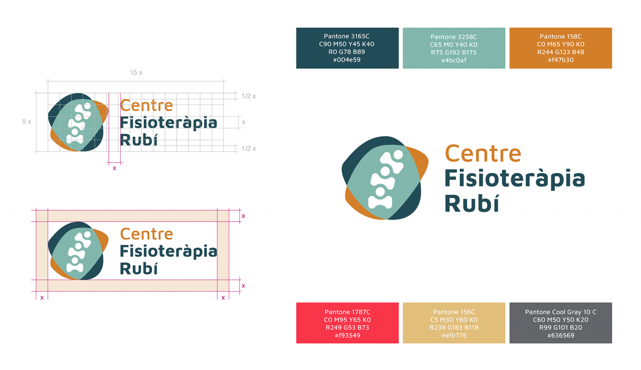
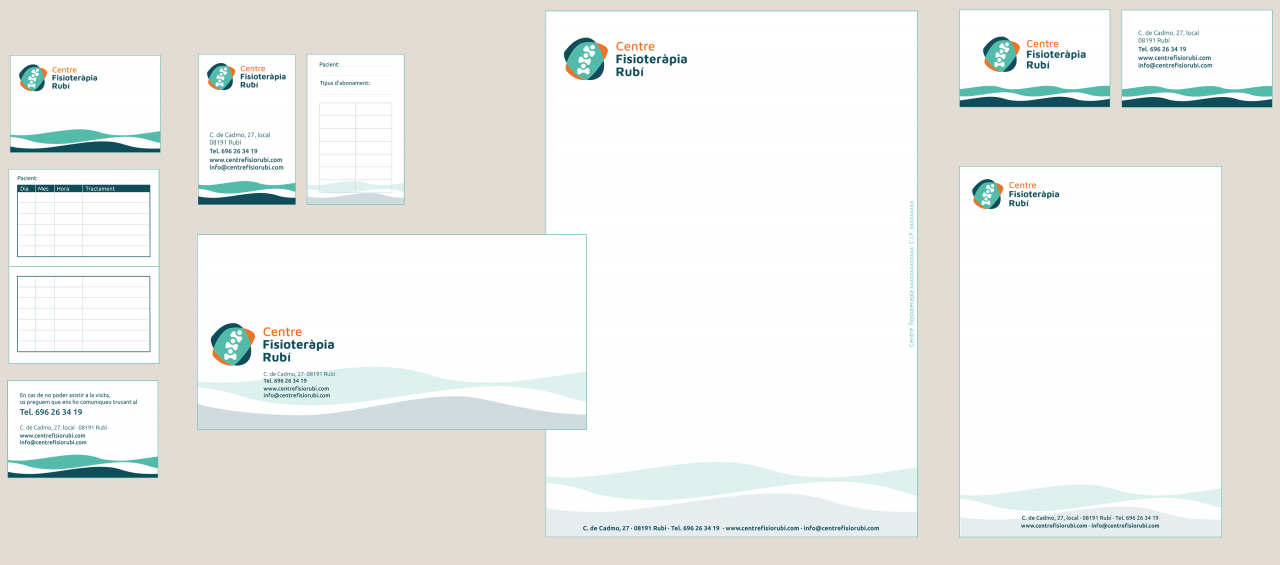
Observing that the differential features of his business were the qualified scientific and therapeutic rigor, perfectly combined with his experience in human and close treatment, we decided that our challenge for his branding was to combine science and human warmth in a single image.

In the sector we usually find more aseptic colors that, although they match very well with medicine and cleanliness, move away from humane treatment and warmth. In our case, the orange color makes the logo friendlier and closer, in contrast to the more aseptic blues.

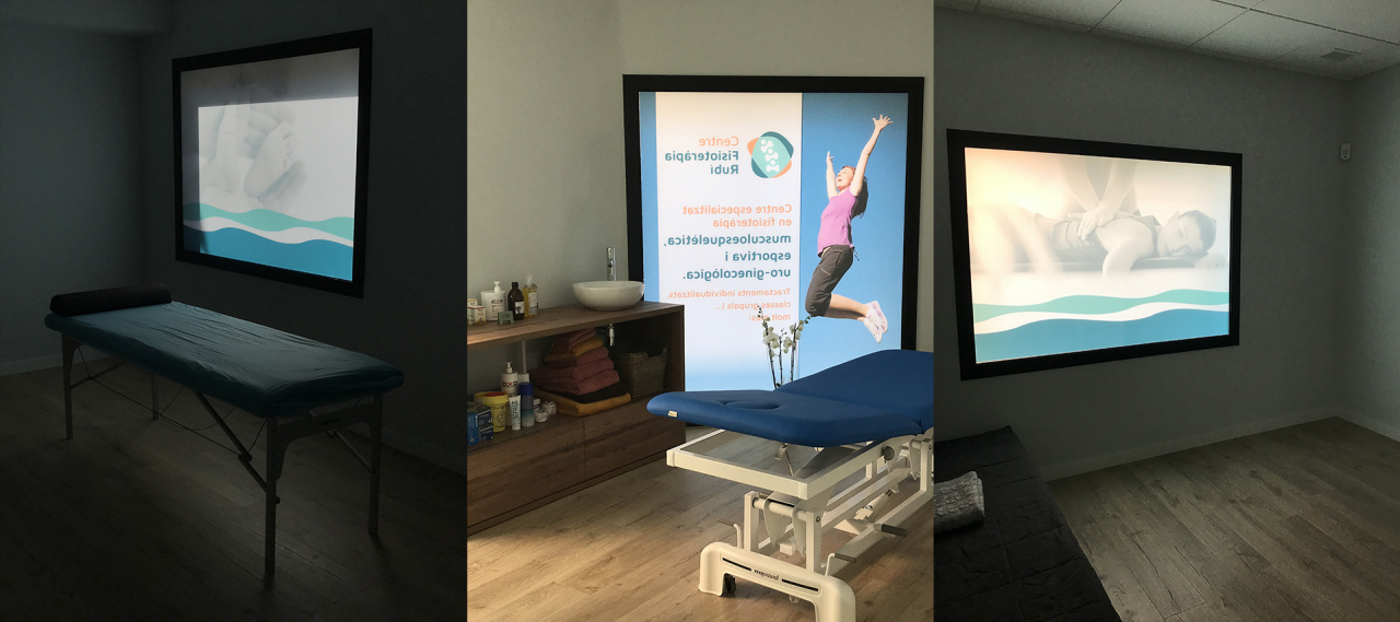
We decorate all the exterior windows of the premises with smoked vinyl with evocative images of the different services that the center offers, this makes the light very relaxing inside, as well as preserving the privacy of the client.
Do you like what you see?
If you think that we can help you in a similar project, fill in your details and we will get back to you shortly. We will love to learn about what you are working on.