Contacto

Rubí Municipal Market Logotype

Brand Architecture

The Municipal Market of Rubi wanted to update its corporate image, taking advantage of the comprehensive renovation taking place in its building after more than half a century in operation.  

The first and most significant work done was on the mainfaçade and on improving access to a new open square. This main part of the market is now wrapped in a unique wave-shaped metallic mesh, which attracts attention and gives it a distinctive new identity.  

Logo Mercat/Mercado/Market de Rubí

Logo for the Municipal Market of Rubí

For the design of the new corporate identity we kept all of this in mind and were inspired by the diamond-shape used in the wrapped mesh of the façade, using that as a base for designing the M of the market’s logo.

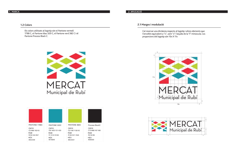
Style Guide, guía de estilo, guia d'estil logo

Additionally, to compensate the symmetry and seriousness of the logo, we selected a palette of three colours and used them randomly, in keeping with the seemingly unplanned distribution of the market stalls.  

Corporate logo aplications wall

The colours, in fact, represent the three principal fresh product groups which can be found in the market: meat, fish and fruit & veg.

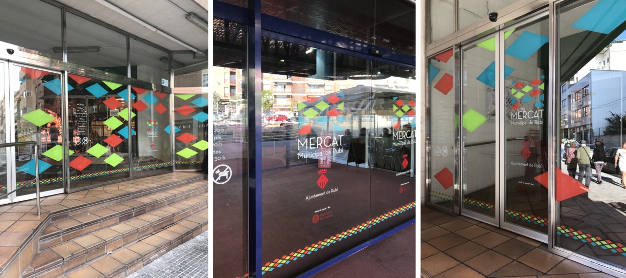
Corporate logo aplications windows

Use of the corporate image at the entrance.

Do you like what you see?

If you think that we can help you in a similar project, fill in your details and we will get back to you shortly. We will love to learn about what you are working on.